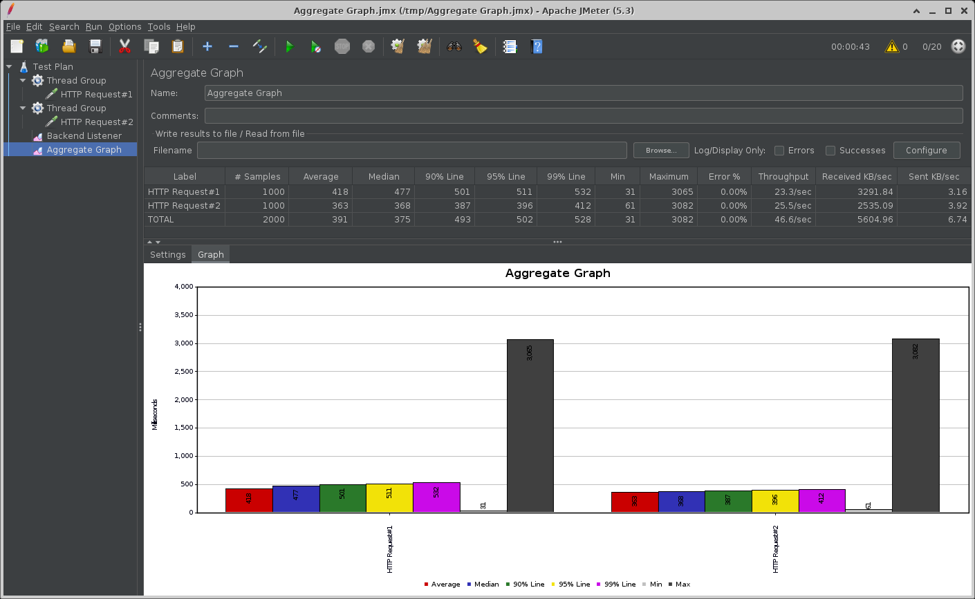
Apache JMeter™のAggregate GraphをApplication Insights / Log Analyticsで表示する
Azure Application Insights / Log AnalyticsでJMeterのAggregate Graphを見る方法を紹介します。

jmeter-backend-azureプラグインを利用してMeterでのテスト結果をAzure Application Insightsに送ることで、Application InsightsやLog AnalyticsでJMeterのテスト結果を参照することができるようになります。
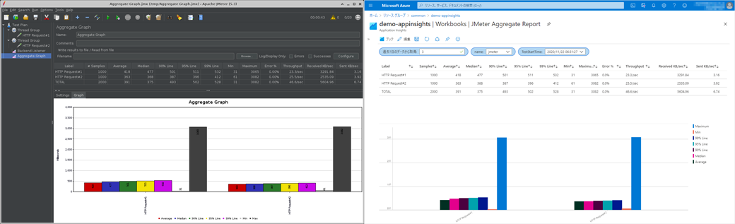
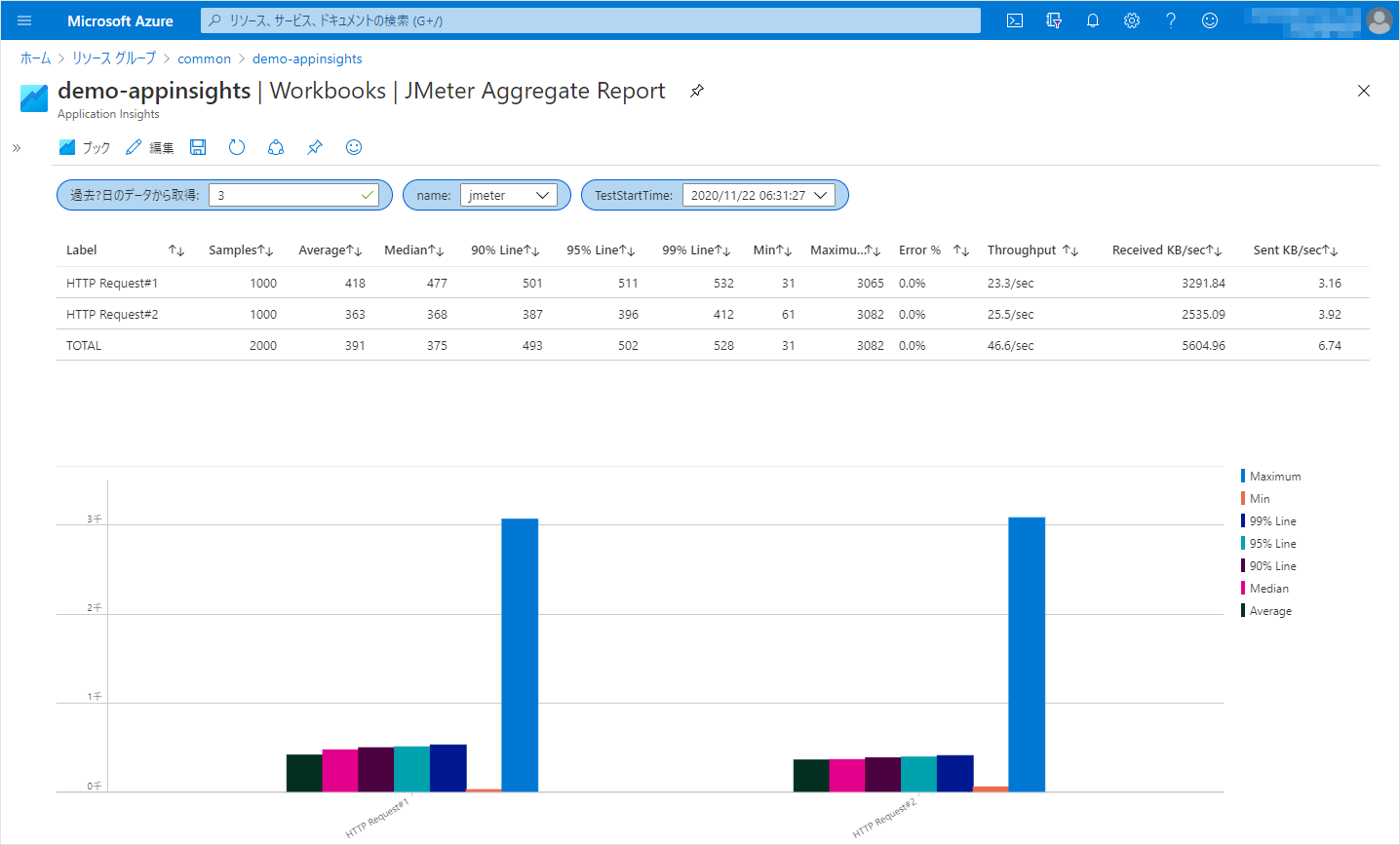
今回はApplication InsightでJMeterのAggregate Graphを表示してみましょう。
jmeter-backend-azureプラグインの導入と設定
こちらの記事を参照してください。
Application Insights / Log AnalyticsでのAggregate Graphの表示
Aggregate Graphは、表とグラフを表示するレポートのため、今回はApplication InsightsのWorkbooksで表示します。
Log Analyticsのブックで表示する場合はテーブル名や列名が異なるので、以下の対応表に従って置き換えてください。
| - | Application Insights | Log Analytics |
|---|---|---|
| テーブル | requests | AppRequests |
| 列 | timestamp | TimeGenerated |
| name | Name | |
| success | Success | |
| duration | DurationMs | |
| customDimensions | Properties |
-
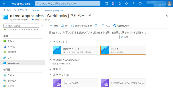
Application Insights Workbookの作成
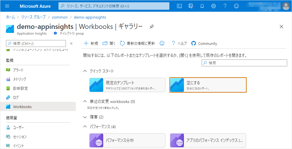
JMeterが結果を送信しているApplication InsightsのWorkbooks (Log Analyticsの場合は「ブック」)を開き、クイックスタートの『空にする』をクリックします。
-
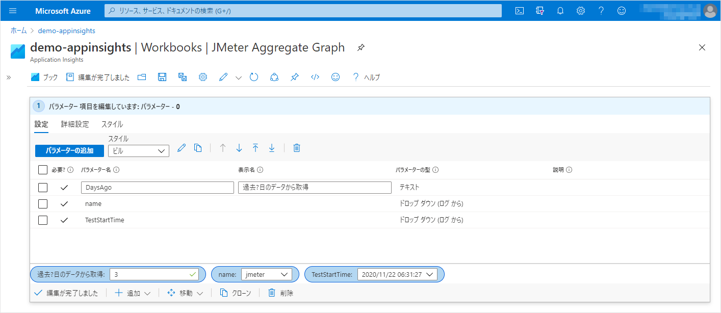
パラメーターの追加
表示対象のテスト結果を選択するために、『+追加』から「パラメーターの追加」をし、以下のパラメーターを追加します。-
パラメーター#1
- パラメーター名: DaysAgo
- 表示名: 過去?日のデータから取得
- パラメーターの型: テキスト
- 必須: On
- Add Validations
- Regular Expression: ^[0-9]+$
- Match: On
- Message: 1以上の数値を入力してください
-
パラメーター#2
- パラメーター名: name
- パラメーターの型: ドロップ ダウン
- 必要?: On
- データの取得元: クエリ
- Application Insights ログ クエリ
-
時間の範囲: クエリに設定します
-
Kusto
requests | where timestamp >= ago({DaysAgo}d) | summarize TestStartTime = max(tolong(customDimensions.TestStartTime)) by name = tostring(name) | sort by TestStartTime desc | project name
-
-
パラメーター#3
- パラメーター名: TestStartTime
- パラメーターの型: ドロップ ダウン
- 必要?: On
- データの取得元: クエリ
- Application Insights ログ クエリ
-
時間の範囲: クエリに設定します
-
Kusto
requests | where name == "{name}" and timestamp >= ago({DaysAgo}d) | extend TestStartTime = tostring(customDimensions.TestStartTime) | distinct TestStartTime | project TestStartTime, formattedTestStartTime = format_datetime( unixtime_milliseconds_todatetime(tolong(TestStartTime)), 'yyyy/MM/dd HH:mm:ss' ) | sort by TestStartTime desc
-
設定が済んだら、適当な値を選択しておきましょう。

-
-
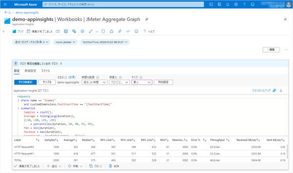
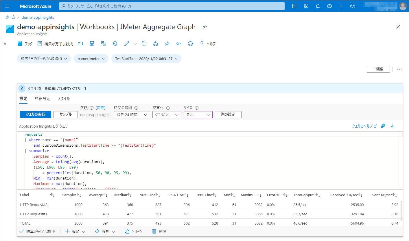
表の作成
『+追加』から「クエリの追加」をし、Aggregate Reportを追加します。-
時間の範囲: クエリに設定します
-
Application Insights ログ クエリ
requests | where name == "{name}" and customDimensions.TestStartTime == "{TestStartTime}" | summarize Samples = count(), Average = tolong(avg(duration)), (L50, L90, L95, L99) = percentiles(duration, 50, 90, 95, 99), Min = min(duration), Maximum = max(duration), ErrorCount = countif(success == false), ReceivedKB = sum(tolong(customDimensions.Bytes)), SentKB = sum(tolong(customDimensions.SentBytes)), StartTime = min(tolong(customDimensions.SampleStartTime)), EndTime = max(tolong(customDimensions.SampleEndTime)) by Label = tostring(customDimensions.SampleLabel) | extend s = 0 | union ( requests | where name == "{name}" and customDimensions.TestStartTime == "{TestStartTime}" | summarize Samples = count(), Average = tolong(avg(duration)), (L50, L90, L95, L99) = percentiles(duration, 50, 90, 95, 99), Min = min(duration), Maximum = max(duration), ErrorCount = countif(success == false), ReceivedKB = sum(tolong(customDimensions.Bytes)), SentKB = sum(tolong(customDimensions.SentBytes)), StartTime = min(tolong(customDimensions.SampleStartTime)), EndTime = max(tolong(customDimensions.SampleEndTime)) | extend Label = 'TOTAL', s = 9 ) | extend tp = Samples / ((EndTime - StartTime) / 1000.0), KBPeriod = (EndTime - StartTime) * 1024 / 1000.0 | sort by s asc | project Label, Samples, Average, Median = round(L50), ['90% Line'] = round(L90), ['95% Line'] = round(L95), ['99% Line'] = round(L99), Min, Maximum, ['Error %'] = strcat(round(ErrorCount * 100.0 / Samples, 2), '%'), ['Throughput'] = iif(tp < 1.0, strcat(round(tp * 60, 1), '/min'), strcat(round(tp, 1), '/sec') ), ['Received KB/sec'] = round(ReceivedKB / KBPeriod, 2), ['Sent KB/sec'] = round(SentKB / KBPeriod, 2) | project-reorder Label, Samples, Average, ['Median'], ['90% Line'], ['95% Line'], ['99% Line'], Min, Maximum, ['Error %'], ['Throughput'], ['Received KB/sec'], ['Sent KB/sec']
-
-
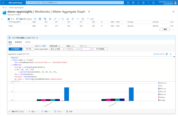
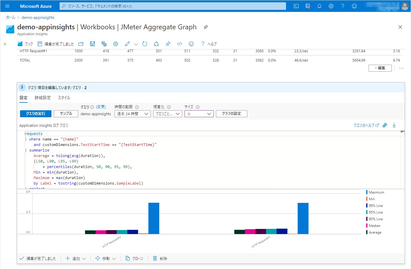
グラフの作成
『+追加』から「クエリの追加」をし、グラフを追加します。
今回は、Average, Median, 90% Line, 95% Line, 99% Line, Min, Maxの棒グラフを表示することとします。-
時間の範囲: クエリに設定します
-
Application Insights ログ クエリ
requests | where name == "{name}" and customDimensions.TestStartTime == "{TestStartTime}" | summarize Average = tolong(avg(duration)), (L50, L90, L95, L99) = percentiles(duration, 50, 90, 95, 99), Min = min(duration), Maximum = max(duration) by Label = tostring(customDimensions.SampleLabel) | project Label, Average, ['Median'] = round(L50), ['90% Line'] = round(L90), ['95% Line'] = round(L95), ['99% Line'] = round(L99), Min, Maximum | project-reorder Label, Maximum, Min, ['99% Line'], ['95% Line'], ['90% Line'], Median, Average | render barchart with (kind = unstacked) -
視覚化: クエリごとに設定
「Application Insights ログ クエリ」にKustoクエリを入力した後、一度『クエリごとに設定』以外を選択し、再度『クエリごとに設定』を選択します。 -
グラフの設定
先ほど書いた手順に従って「視覚化」で『クエリごとに設定』を選択しなおすと『グラフの設定』ボタンが表示されます。
- X 軸 設定
- 列: Label
- 凡例の設定
- メトリック情報の表示: Off
- 系列の凡例の表示: On
- X 軸 設定
-
-
Workbookの保存
「保存」アイコンをクリックして、作成したWorkbookを保存しておきましょう。
これで、パラメータを適当に選択することで、以下のように表示されます。
以上、JMeterのAggregate GraphをAzure Application Insights / Log AnalyticsのWorkbooksで表示する方法を紹介しました。
【宣伝】
AzureにJMeterの分散テスト環境を簡単構築
『Load Tester Powered by Apache JMeter™』